MobileFuse
Insight Report Redesign and Optimization
For each mobile ad campaign run by MobileFuse, an insight report is generated to visually present trafficking data in a clear and client-friendly format. I led a comprehensive redesign of these reports, enhancing the visual design and optimizing the process of creating these reports, while guiding the data visualization choices to ensure accurate and impactful storytelling. Before the redesign, our operations team was using metrics in an inaccurate way and twisting the story to tell something other than the truth. I advocated for and ultimately achieved a solution that provided a trustworthy and honest communication of campaign performance.
Deliverables
Adobe Illustrator report template and specifications, icon library, instructions for use and creation for various layouts/data amounts, guidelines for chart usage
Core Team
Designer (me)
Background
The Problem
The original insight report process and design presented several visual and functional flaws:
All data was displayed on a single continuous PDF page, resulting in excessively long reports and poor searchability for large campaigns
Text formatting lacked consistency, with font sizes varying between too small and disproportionately large
Data presentation was often inaccurate, leading to misleading interpretations of campaign performance
These reports were manually compiled by designers, without an automated or streamlined process in place. This made report creation and editing very time-consuming and inefficient, often requiring several hours per report.
Reports were prone to errors due to the manual nature of the creation process
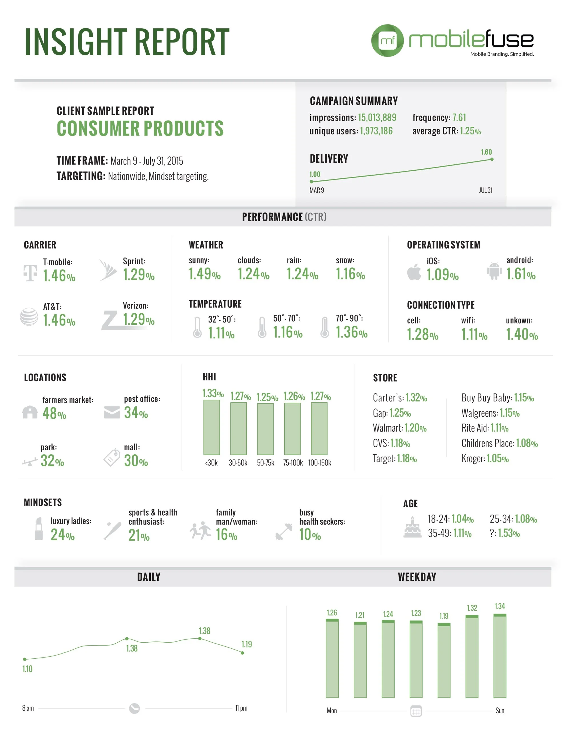
Current insight report example (before redesign)
Goals
Business Goal
Stakeholders identified the need for a more efficient and scalable process to generate reports quickly and consistently. They also emphasized the importance of aligning the reports with MobileFuse’s refreshed branding, requesting a modernized, clean, and simplified visual appearance.
User Needs
The primary users in this case were the designers responsible for creating the insight reports, most of whom were proficient in the Adobe Creative Suite. Key requirements for the redesign included:
Providing a flexible solution that adapts to different data types and volumes
Reducing effort by standardizing spacing, alignment, color, and typography choices
Creating a streamlined system for easily locating and selecting appropriate icons and chart types
Client Goals
Our clients prioritized several key aspects:
Receiving insight reports promptly following the completion of their ad campaigns
Ensuring the accuracy and reliability of the data and the story it presented
Accessing reports that were clear, well-organized, and easy to review, especially as they accumulated multiple reports over time
Redesign Details and Process
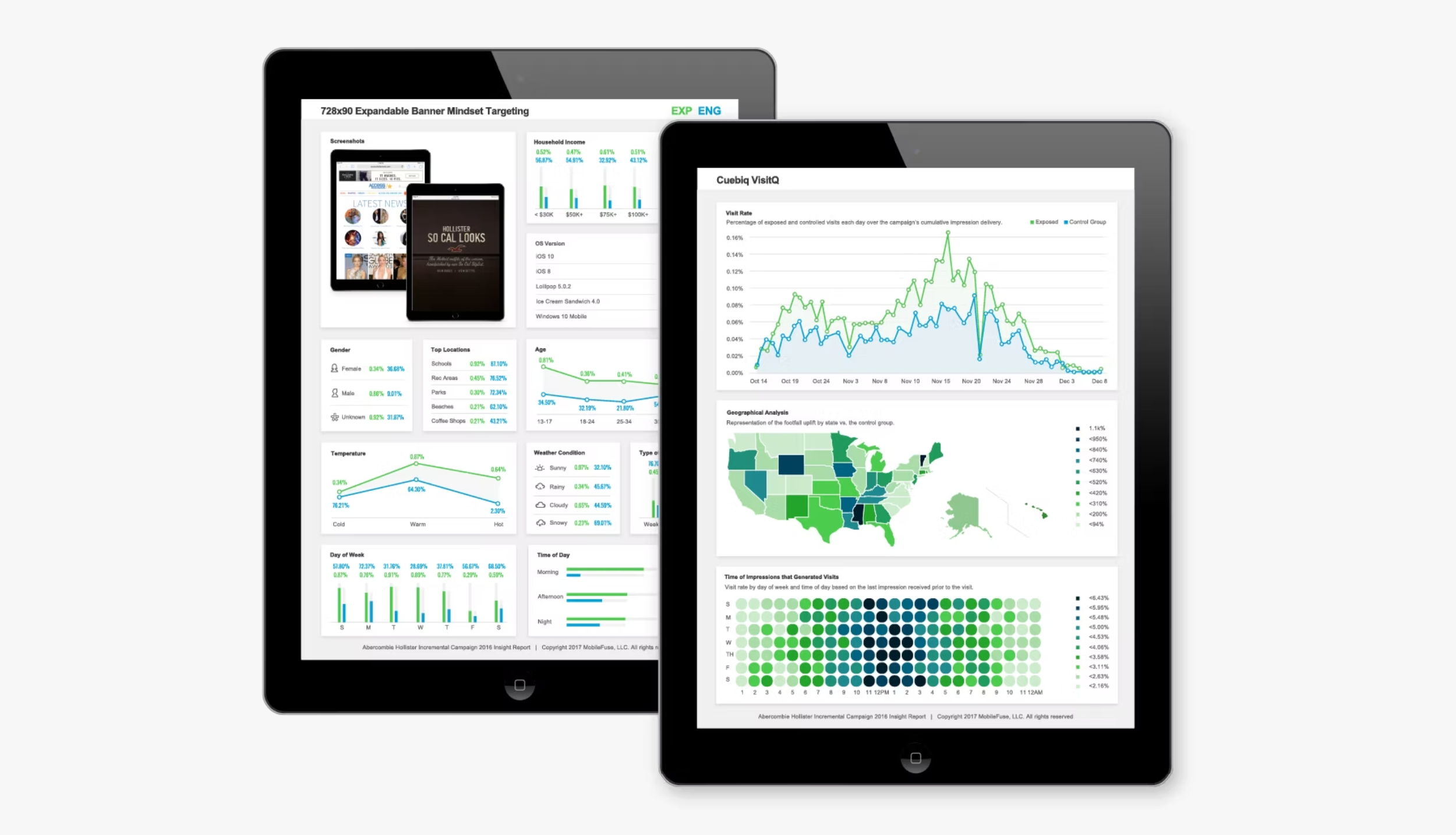
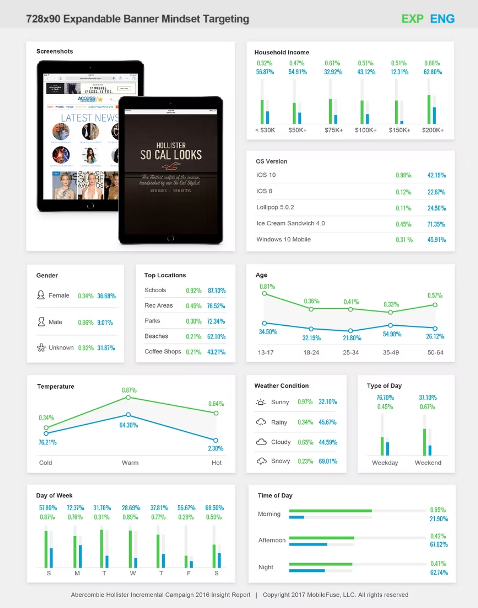
The redesign incorporated updated colors, typography, and chart formats. It provided a dedicated page for each ad placement within every campaign, a new layout system designed to improve efficiency for designers when generating reports, a consistent icon library with scalability options, and an instructional guide for when to use what types of charts for various data types. Additionally, a cover page was added to assist clients in recognizing and organizing their reports and to create a more polished and professional appearance.
Research
The redesign decisions I made for this project were informed from the research I performed:
Interviewing leads from design, account management, and operations to understand the data being collected, pain points in their insight report processes, and understand client reporting needs
exploration of the new brand guidelines
audit existing reports to understand what’s working, what’s not and where gaps exist
competitive analysis and benchmarking to build awareness of industry trends for data visualization
Design
Once understanding the problem and the requirements for the redesign, I worked on the design in various stages:
Layout Ideation: Standardized and templated report page compositions based on chart and metric requirements
Chart Redesign: Developed charts to accurately display the stories of ‘click-through rate’ and ‘engagement’ metrics, individually or combined
Color Assignment: Selected an accessible color palette while aligning with brand color schemes and ensuring clarity across text, icons, and data visuals
Iconography: Established a consistent icon style and created a centralized library of commonly used icons
Integration: Enhanced the overall viewer experience by adding qualitative page information to set context and expectations up front


Future Vision
A key constraint during this redesign was the inability to develop an automated, digital reporting platform due to limited developer resources, funding, and tool availability at the time. Consequently, the reports continued to be produced manually. However, I maintained a forward-looking approach, designing with digital automation in mind with the hope for future implementation. To prepare for this transition, I proactively explored and began learning D3, a JavaScript library for data visualization, and collaborated closely with developers during design reviews to ensure feasibility and provide awareness.